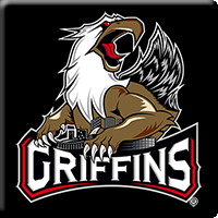
A new era of Grand Rapids Griffins hockey took flight on Tuesday, as the franchise unveiled a bold new primary logo and jersey redesign in advance of its 20th anniversary season, during an invitation-only event at Van Andel Arena’s Intermission Restaurant & Bar.
Marking the first primary logo change in the history of the franchise, the Reebok-designed logo features Griff fiercely protecting the skyline of Grand Rapids, reinforcing the pride that the Griffins have in their city while portraying an aggressiveness that was absent from the original logo. Prior to its adoption as the primary logo, the artwork had been featured on the Griffins’ home Wednesday jerseys since 2012.
"Each season we review every aspect of our business and look for ways that we can improve. This year, as we underwent this process heading into our 20th season, we looked at ways to modernize our logo,” said Griffins president Tim Gortsema. “While the traditional and original Griff has been and always will be a storied part of our team’s history, we desired a fiercer incarnation that also incorporates our amazing city’s skyline.
“Just as Griff protects our city on this striking new jersey, our hockey team must do the same as we protect home ice, assisted by the loudest and most supportive fans in the American Hockey League,” added Gortsema.
Griffins captain Jeff Hoggan and defenseman Scott Czarnowczan modeled new home and road uniforms for a crowd of more than 300 season ticket members, sponsors and media. Most notably, the team has added black to its color scheme for the first time, after prominently featuring blue as part of its first three jersey designs (1996-02, 2002-07 and 2007-15). Red remains a principle color, in part reflecting the organization’s strong affiliation with the Detroit Red Wings, while silver and gold have been retained as accents.
Designed in conjunction with Reebok, the Griffins’ CCM home jerseys are predominantly white, accentuated by black shoulders, striping and numbers, along with silver and red trim and a reverse-color nameplate (white on black). The road jerseys are black with silver striping, white numbers and lettering, and silver and red trim.
Both versions have a lace neck – a first for a standard Griffins jersey – and shoulders that feature a 20th anniversary patch (left) and a Red Wings logo (right).


