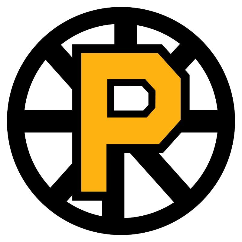
The Providence Bruins have announced the introduction of their new primary and secondary logo, to be phased in throughout the 2012-13 regular season.
The re-introduced primary logo is a cleaner, bolder edition of the original spoked “P” logo that has been featured on the P-Bruins’ home jerseys since 1995. The logo itself is derived from the Boston Bruins’ primary logo from the late 1950’s to the mid-1960’s, and represents the relationship between the P-Bruins and their parent club in mimicking that original logos color scheme and simplicity.
This new logo also represents a fundamental shift in focus for the Providence Bruins brand towards a more traditional, “old-time hockey” look and feel. This move coincides with the 2013 Dunkin’ Donuts AHL All-Star Classic, hosted by the Providence Bruins the weekend of January 25-28, which also reflects the new direction of the team’s visual identity.
In addition, the secondary logo is now officially the “bear” logo, which has been featured most recently as a crest on the P-Bruins black alternate home jerseys. This logo also reflects the same ideals that the new primary aims to accomplish.
The Providence Bruins, established in 1992, are the top affiliate of the 2011 Stanley Cup champion Boston Bruins. Celebrating their 20th anniversary season in 2011-12, the Providence Bruins have enjoyed much success over their history. The team won the American Hockey League’s Calder Cup championship in 1999 and boasts 10 former players on the 2011 Stanley Cup champion Boston Bruins. In addition to accomplishments on the ice, the Providence Bruins were fourth-best in attendance in the AHL in 2010-11 and are the best-attended minor-league hockey team in New England.


