


The Bakersfield Condors unveiled their new primary logo for the upcoming 2015-16 season, the team’s first in the American Hockey League, at an event held today at the Bakersfield Marriott at the Convention Center.
“This is another step in building the excitement for this historic move to the American Hockey League,” said Condors team president Matthew Riley. “The new logo is dynamic, fierce, and incorporates our new blue and orange color scheme. With this logo we are able to further our established brand of the past 17 years, while uniting us in our new chapter with the Edmonton Oilers, a team with great tradition over the past 35 years.”
“The new Condors logo is yet another great step in bringing Bakersfield fully into the Oilers family. The iconic blue and orange colors, bold and vivid, will strike a strong chord with Condors fans and be a great symbol of the importance of the team and the city to the long-term success of the Oilers,” said Edmonton Oilers assistant general manager Bill Scott.
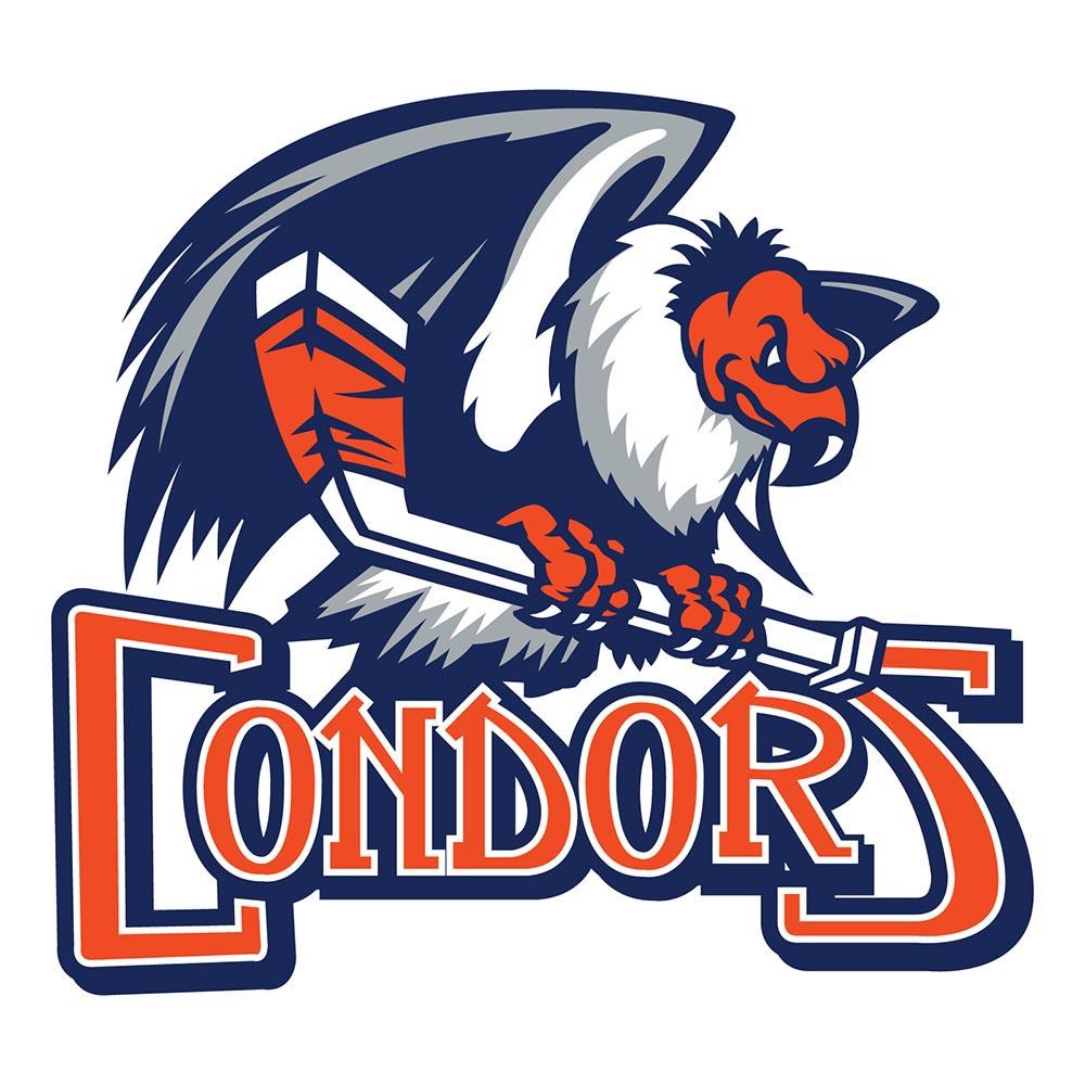
ABOUT THE LOGO
– A modern, updated version of the condor which has been featured as the primary logo for each of the team’s 17 seasons
– The condor now has orange skin which adds personality and strengthens the association to the Oilers brand
– The Condors wordmark is retained, but the circle has been permanently removed
– The stick is now white with orange tape to pop out from the condor itself
– Official colors: Oilers Royal Blue and Orange with the addition of Dark Grey
– The primary mark will be used on all Condors AHL designations beginning on April 12, 2015
– A secondary logo will be revealed along with home and road jerseys later this summer