


 Danny Williams, president and chief executive officer, today announced that the new AHL franchise in Newfoundland and Labrador will be called the St. John’s IceCaps.
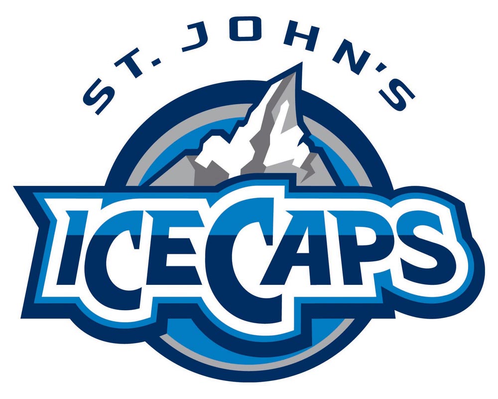
Williams was joined by Glenn Stanford, AHL governor and chief operating officer of the team, at Mile One Centre, where they also unveiled the team logo.
“I am so pleased to present the St. John’s IceCaps and our new logo to fans, as we begin a new era of professional hockey in the province,” said Williams. “The IceCaps is a name that I am confident hockey fans will support as it captures both our rich hockey history with a reference to the Caps, while at the same time capturing a natural element that is iconic for the province, ice. We wanted to ensure that, although the team is based in our capital city, the province as a whole can identify with it and embrace it as their own.”
The logo consists of "IceCaps" over rugged mountains. The mountains are capped with ice that is an illustrative map of Newfoundland and Labrador. The colors are reflective of those used in the logo of the parent team, the Winnipeg Jets.
Known for its tough but resilient northern climate, Newfoundland and Labrador has strong ties to ice in many forms. From the iconic majestic iceberg, which attracts hundreds of thousands of tourists a year, to ocean exploration and ice capped landscapes, the association of the word to a sport that is played on an ice surface was a natural fit in naming the team. “Caps” not only perfectly complements the name in the literal translation of an icecap, it is also pays tribute to the St. John’s Caps, a Newfoundland Amateur Hockey Association team which played in the former provincial senior hockey league.
“The beauty of the ice-capped mountains, the outline of Newfoundland and Labrador displayed prominently and the jagged look of the mountains themselves are all indicative of the robust nature of our province,” said Stanford. “We also expect it to be a staple of our team: hard-working, tough and rock solid.”
Williams said it was important to him to ensure the province was represented well in the new name and logo, as it will be a marketing tool for Newfoundland and Labrador in 29 other cities throughout the league.
“From Houston to Abbotsford, B.C., to Chicago and Milwaukee, this name and image will market not just our team, but also our province,” added Williams. “In every aspect of my life from business to politics to hockey, I have always made every effort to promote this incredible province to the world, as a unique and attractive place. In this name and with this logo, we have captured the essence of what it is to be a province in the middle of the North Atlantic. We have built on our strengths and our natural assets, and created a team name that will once again put this province on the map.”
Stanford said with 20 years experience in the AHL, he is excited to introduce to name and logo to the league where brand is so important.
“It is critical to have a name and logo that fans at home can embrace and fans on the road will remember,” said Stanford. “This name and logo does both. The St. John’s IceCaps will be a memorable and easily identifiable team in the league, and I am excited to start promoting it both here at home and abroad.”
Williams also announced that the team’s home opener will be played on Oct. 14 at Mile One Centre.
In addition to the name and logo announcement, the IceCaps announced four new members of the club’s staff as it prepares for the 2011-12 season.
Don Power joins the IceCaps as the communications director, Brian Rogers will be the broadcaster, Alain Chabbert is the team’s athletic therapist and Ian Cox is the team’s equipment manager.