


 In recognition of the San Antonio Rampage’s fifth anniversary in the Alamo City, the club on Thursday unveiled its new uniform and colors for the upcoming season. The team officially changed its colors to silver, black and grey in order to reflect consistency of the brand across all three Spurs Sports & Entertainment franchises.
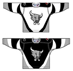
The team’s official colors are now in line with the three-time NBA champion San Antonio Spurs and the WNBA’s San Antonio Silver Stars. The primary and secondary logos have not changed in design, but the team has added an alternate logo of just the Rampage bull head.
"As Rampage hockey continues to evolve in San Antonio, we felt that it was important to have the colors on our jerseys consistent with black and silver of the Spurs uniforms," said Russ Bookbinder, executive vice president of business operations for Spurs Sports & Entertainment. "These colors represent a great tradition of winning and awareness in our market and our goal is that all of our franchises reach that level of success."
The home jersey has a white body, with a black and light gray trim, while the road jersey has a black body with a white and light gray trim. Both jerseys feature the Rampage bull head on the chest with the secondary logo appearing on the right shoulder and the Phoenix Coyotes-their NHL parent club-logo on the left shoulder. The uniform is completed with and black, grey and white socks and black pants. The jerseys were produced by Reebok/CCM, the premier supplier of the American Hockey League.
The primary logo is a rampaging bull with a silver, black and grey color scheme. The secondary logo depicts the rampage bull head in front of with two hockey sticks crossing each other. The original logo was designed by Al Aguilar and Jamie Stolarski with Creative Civilization-an Aguilar/Girard Agency.