


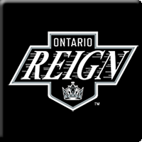
The Ontario Reign have unveiled a new logo and jerseys for the 2015-16 season – their first season as members of the American Hockey League – that reflect the design of their parent club, the Los Angeles Kings.
"It is very important to the LA Kings that the Ontario Reign hockey club have its own unique look and logo. We did want it to represent the Kings and the brand that we have worked so hard to establish over the years but — at the same time — we made sure it works well with Ontario," LA Kings President of Business Operations Luc Robitaille said. "I personally like it a lot because it has that retro look and feel to it. We believe it is going to be a hit with hockey fans here and beyond."
The home jerseys are white with black and gray stripes along the waist and elbows. A black stripe accents the shoulders and sleeve of the jersey, and the Kings shield logo is featured on both shoulders. The road jerseys are black with white and grey stripes along the waist and elbows, and a grey accent along the shoulders and sleeves. The new logo is displayed prominently on the chests of both jerseys.
"These jerseys tie us to our parent club, the Kings," Reign President Darren Abbott said. "The Reign will begin a new era in the American Hockey League next season as the primary affiliate of the Kings. We have had many players for this franchise go on to help Los Angeles win Stanley Cup Championships, and now that identity can become an even greater part of the Reign culture."
Visit ontarioreign.com/ahl for additional information.