


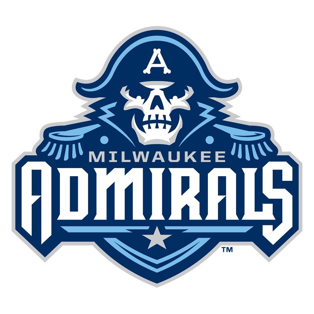
The Milwaukee Admirals are excited to usher in a new chapter in team history with the unveiling of a bold new logo and jerseys.
The new logo is an evolution of the Admirals last logo and features a more fierce and determined sailor. The sailor is accented by the upper portion of a naval uniform and a hat that was inspired by the one worn by the Admirals “Captain Crunch” logo from the late 70s and early 80s. The hat is adorned with an “A” composed by three bones.
The Admirals secondary mark, dubbed the M&A, is the letters “M” and “A” interwoven in bone script and connected with a hockey stick for the horizontal bar of the “A”.
The primary color of the new look now shifts to navy blue (Pantone 282) with the same Lake Michigan blue (Pantone 292) accents used with the previous logo and a gray outline.
The Admirals new jerseys will both feature the head of the sailor on the front of the with the M&A mark on both of the shoulders. The home sweater will be primarily white with navy blue sleeves, accented by Lake Michigan blue piping and a touch of gray separating the two blues. The road jerseys will be navy blue with Lake Michigan blue sleeves and white accents.
The Ads will continue use of their third jersey from previous seasons that featured the popular full body logo. The only difference is the black in the full body logo is replaced with navy.
The new look was conceived in coordination with Studio Simon, a sports brand identity development company out of Louisville, Ky. Studio Simon is one of the leaders in sports brand identity development and has teamed up with over 100 professional, collegiate, and amateur teams, leagues, and businesses including the NFL, the Minnesota Twins, and the Kentucky Derby.