by Patrick Williams
Maybe you remember sketching hockey logos in the back of a notebook as a kid.
Bringing a pro hockey club’s new logo to life is something like that, at least at the start.
However, any old logo would not do for the Cleveland Monsters’ makeover, and the project soon stretched far beyond a few pencil-and-paper sketches.
Simplify the look. Black-and-blue. Hard-nosed hockey for a hard-nosed city. Make it something that Cleveland hockey fans could call their own.
Sketching out some of the earliest ideas, those principles began to shape the search for a new look and color scheme.
“We know the monster — the logo itself, and just the brand and the name — were popular with our fans,” Monsters president Mike Ostrowski said. “There’s always this kind of balance. What do you do to not change it too much because people like it, but still have it evolve into the future?”
Addressing those questions entailed a multi-year in-house process helmed by brand managers and graphic designers from Rock Entertainment Group, the entity that owns the Monsters as well as Rocket Mortgage FieldHouse and the Cleveland Cavaliers among several other properties.
“It literally starts with sketches on pen and paper,” Monsters senior vice president and chief marketing officer Ben Adams said. “It starts with drawings and very talented people taking not-so-direct direction from people like myself that have an idea but don’t necessarily have the talent to make it work. That’s a cool thing to see come to life.”
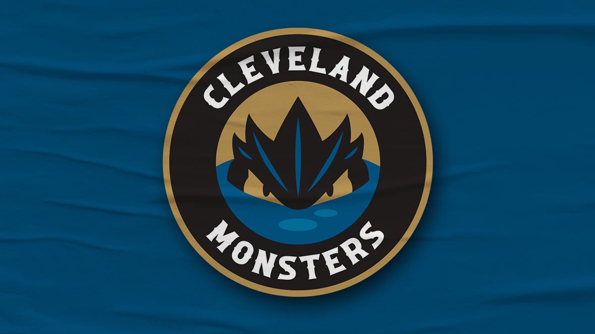
The result is a brand-new logo and a black-blue-and-gold color scheme for the Monsters, who will begin their 17th American Hockey League season this October. A new “head-on” monster-themed logo will be the primary logo and feature the city’s name prominently. The long-standing “lurking monster” remains, this time as a secondary logo. A new nautical “M” wordmark will debut.
It’s a new look, but it is one with enough elements retained to make it quickly feel familiar.
“This will be our most significant visual change to the monster,” Ostrowski explained. “The most visible one will be that front-facing monster. There’s so much legend with the monster and the suspense of this creature in the water and what does it really, truly look like? I know a big piece from our creative team was actually having the monster facing forward and with this circular logo. [It was a] really, really big deal in terms of having that come together.”
As for the colors, there is “Bessie Black” for the monster. “Lake Blue” pays homage to the area’s identity on the shores of Lake Erie, as well as to the Cleveland Barons, the nine-time Calder Cup champion that played in the city from 1937 to 1973. A new shade of gold rounds out the new color palette.
“The cool thing about this is we’re taking the two colors that were most prominent in our logo throughout the team’s history and just really making the brand reflect those two colors even more,” Adams outlined.
Adams and his staff teamed with David Freeman, Rock Entertainment Group’s vice president of creative and production, to lead the project. Freeman guided the creative team that featured graphic designer James Adams. Along with the new logo and colors, the club worked with CCM on updated jerseys.
Considerable logistics work also accompanies any new logo release. There is new letterhead adorned with the updated logo to order. Merchandising partners are involved. An audit of every inch of Rocket Mortgage FieldHouse was undertaken, and the new logo will replace the old logo throughout the sprawling facility.
“You think maybe you’ve got your logo in a couple places in the arena,” Ben Adams said. “And then you start to dive in, you find it in every other nook and cranny you never thought to check. Luckily we have some great people internally who have a total handle on where our brand is being used. Logistically we had a lot of support from the league as well and CCM.
“It’s something that is made as easy as possible, but it’s a big, big change.”
Before that finished result takes the ice in October, the team will hold a special event tonight at Rocket Mortgage FieldHouse for its Monsters Hockey Club members and stakeholders.
“The takeaway that I’m hoping fans have is that this is a brand that they can truly own as Cleveland hockey fans,” Adams said. “We are really setting out to be very clear about 16 years in, this is who we are.”
Black-and-blue hockey. With a splash of gold. A look that blends Cleveland’s hockey history, location and civic identity.
“We have great fans,” Ostrowski said. “They continue to show up here. They just love their Monsters. We hope they really love this and can get behind it and make this team their own.”
TheAHL.com features writer Patrick Williams has been on the American Hockey League beat for nearly two decades for outlets including NHL.com, Sportsnet, TSN, The Hockey News, SiriusXM NHL Network Radio and SLAM! Sports, and was most recently the co-host of The Hockey News On The ‘A’ podcast. He was the recipient of the AHL’s James H. Ellery Memorial Award for his outstanding coverage of the league in 2016.